
How many attempts will the computer need to guess your number?: A game written with React.js and React Native for IOS and Android

https://videopress.com/v/xP0WGzzu?resizeToParent=true&cover=true&autoPlay=true&loop=true&preloadContent=metadata&useAverageColor=true
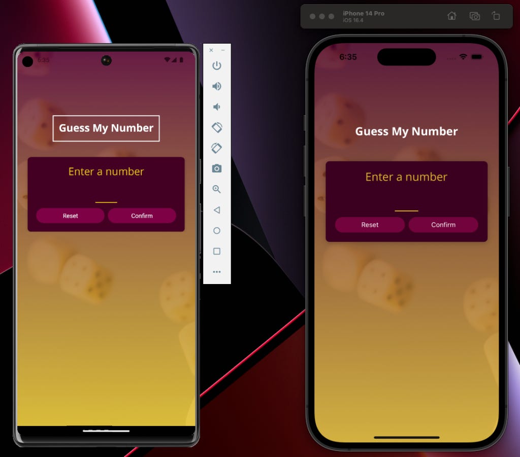
Hello readers! I am back with another mobile application for IOS and Android and this one is fun. In this application, we allow the user to choose a number between 1 and 100 and then in the following screen, we allow the computer to continually guess the number until it guesses correctly. In between this, you are giving hints to the computer by indicating whether the number it guessed was lower or higher than the number you chose to help it a little bit along the way. You are not allowed to cheat and tell the computer that they should guess lower when in fact they should be guessing higher, which we enforce with some validation.
Here are some things we focused on while building the game:
Creating your own custom buttons between both platforms
Launching IOS keyboards for testing
Navigating to a new screen and passing data as props
Accommodating styling for rotating devices
User input
Specific styling for Android and IOS
Working with linear gradients
Working with Splash Screens over AppLoading
One of the most interesting things when you start to develop an app like this is realizing how much flexibility and power you truly have behind the design and logical processing behind your application.
Creating your own custom buttons between both platforms
There is a lot of power packed into this simple code below:
<View>
  <Pressable>
    <Text></Text>
  </Pressable>
</View>
Then, it could turn into a function that looks like this:
function PrimaryButton({ children, onPress }) {
  return (
    <View style={styles.buttonOuterContainer}>
      <Pressable
        onPress={onPress}
        android_ripple={{ color:  Colors.primary600r}}
        style={({ pressed }) =>
          pressed
            ? [styles.buttonInnerContainer, styles.pressed]
            : styles.buttonInnerContainer
        }
      >
        <Text style={styles.buttonText}>{children}</Text>
      </Pressable>
    </View>
  );
}

export default PrimaryButton;

const styles = StyleSheet.create({
  buttonOuterContainer: {
    borderRadius: 28,
    margin: 4,
    overflow: "hidden",
  },
  buttonInnerContainer: {
    backgroundColor: Colors.primary500,
    paddingVertical: 8,
    paddingHorizontal: 16,
    elevation: 2,
  },
  buttonText: {
    color: "white",
    textAlign: "center",
  },
  pressed: {
    opacity: 0.75,
  },
});
Android provides us with an attribute for Pressable that gives the button some effect on the screen. With IOS, you actually have to create a StyleSheet and provide some opacity to show a user some effect when the button is tapped. One nice thing about the style attribute on a <Pressable> JSX tag is that while normally taking an object as a reference, it can also take a function. So, if we ever wanted to apply some styling at the point when the button is pressed, we could write it like this:
<Pressable
        onPress={onPress}
        android_ripple={{ color:  Colors.primary600r}}
        style={({ pressed }) =>
          pressed
            ? [styles.buttonInnerContainer, styles.pressed]
            : styles.buttonInnerContainer
        }
      >
Pressed can be exposed through object destructuring and assessed in runtime to see if a certain style should be applied
Launching IOS keyboards for testing
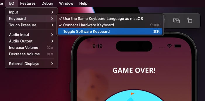
Android and IOS simulators have the ability to toggle on keyboards when needed so you can test keyboard interaction and how it would look across various landscapes and app usage.
Navigating to a new screen and passing data as props
Going back to the example of the button, another reason that its so powerful is the ability for the button to take in a function as a prop and then execute that function in the onPress-{} event of the Pressable tag. This is especially useful because you can pass the behavior that you want your custom button to perform in the context thats appropriate. This creates an amazing amount of reuse to apply within your application. Another important mention of reusability across your app is to create something that adheres to your styling and brand and then reference it all throughout your components so that you ensure consistency without a lot of effort. Here is an example below of passing a function as a prop:
function PrimaryButton({ children, onPress }) {
  return (
    <View style={styles.buttonOuterContainer}>
      <Pressable
        onPress={onPress}
        android_ripple={{ color:  Colors.primary600r}}
        style={({ pressed }) =>
          pressed
            ? [styles.buttonInnerContainer, styles.pressed]
            : styles.buttonInnerContainer
        }
      >
        <Text style={styles.buttonText}>{children}</Text>
      </Pressable>
    </View>
  );
}
and then here is an example of usage and passing in a function from another place:
<View style={styles.buttonContainer}>
            <PrimaryButton onPress={nextGuessHandler.bind(this, "greater")}>
              <Ionicons name="md-add" size={24} color="white" />
            </PrimaryButton>
          </View>
The best thing about this is, if needed, you can also use standard JS principles such as .bind() to pass arguments into the onPress event to distinguish behavior at the button component level which is super powerful.
Accommodating styling for rotating devices
This portion of building the app was actually really cool. There are several factors here when considering how to build your mobile app where screen rotation is required. The first is the useWindowDimensions import from 'react-native' . This imported function allows you to get the width and height of the screen as it relates to the device you are using and what landscape you happen to be in.
const { width, height } = useWindowDimensions();This function allows you to set conditions within your code on how you would like different screens, different elements of screens or different attributes to behave differently if the width ever surpassed a certain amount.
Here, we are setting some JSX configuration into a variable:
let content = (
    <>
      <NumberContainer>{currentGuess}</NumberContainer>
      <Card>
        <InstructionText style={styles.instructionText}>
          Higher or lower?
        </InstructionText>
        <View style={styles.buttonsContainer}>
          <View style={styles.buttonContainer}>
            <PrimaryButton onPress={nextGuessHandler.bind(this, "lower")}>
              <Ionicons name="md-remove" size={24} color="white" />
            </PrimaryButton>
          </View>
          <View style={styles.buttonContainer}>
            <PrimaryButton onPress={nextGuessHandler.bind(this, "greater")}>
              <Ionicons name="md-add" size={24} color="white" />
            </PrimaryButton>
          </View>
        </View>
      </Card>
    </>
  );
As a side note, it is SO COOL that we can set JSX code into a variable and render it conditionally in other parts of your application. Below, we will manipulate the content you see above if the width is above a certain amount:
if (width > 500) {
    content = (
      <>
        <View style={styles.buttonsContainerWide}>
          <View style={styles.buttonContainer}>
            <PrimaryButton onPress={nextGuessHandler.bind(this, "lower")}>
              <Ionicons name="md-remove" size={24} color="white" />
            </PrimaryButton>
          </View>

          <NumberContainer>{currentGuess}</NumberContainer>
          <View style={styles.buttonContainer}>
            <PrimaryButton onPress={nextGuessHandler.bind(this, "greater")}>
              <Ionicons name="md-add" size={24} color="white" />
            </PrimaryButton>
          </View>
        </View>
      </>
    );
  }
The cool thing about useDimensions() is that it is rerendered every time a device rotates. So, each time the user moves their phone to a rotated position, you automatically get a brand new width and height from useDimensions that your component can react to.
One other important factor to mention is adding an orientation to your app.json file and make sure that the app accepts default if you want to allow for rotating screens. if you would prefer portrait or landscape only, you can configure this as well so that the phone does not react.
Specific styling for Android and IOS
One great thing about styling in React Native is that you have a few ways that you can designate styling for the platform you are supporting:
Platform specific files
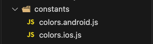
We have the option to designate our directory file names to adhere to the platform you would like those attributes to support. So, all you need to do is import the file, separate from the platform designation like IOS, and React Native takes care of the rest for you.
Using Platform import for react-native
Another option you have is to use the Platform import that allows you to designate styling or behavior based on the detected platform that your device is currently on. Here is an example of how you could update some style properties based on the Platform:
const styles = StyleSheet.create({
    title: {
        fontFamily: 'open-sans-bold',
        fontSize: 24,
        color: 'white',
        textAlign: "center",
        borderWidth: Platform.OS === 'android' ? 2 : 0,
        borderWidth: 2,
        borderColor: 'white',
        padding: 12,
        maxWidth: '80%'
    },
    titleContainer: {
        paddingTop: deviceWidth > 400 ? 48 : 0
    }
})
Working with linear gradients
Expo has a really great library called expo-linear-gradient. One of the requirements for the app was to load in an image asset, make it mostly transparent and then incorporate a linear gradient across the background image for the background of the app. Super cool! See the code below:
<LinearGradient colors={[Colors.primary700, Colors.accent500]} style={styles.rootScreen} onLayout={onLayoutRootView}>
      <ImageBackground
        source={require("./assets/images/background.png")}
        resizeMode="cover"
        style={styles.rootScreen}
        imageStyle={styles.backgroundImage}
      >
<LinearGradient/>
This LinearGradient tag allows you to pass in an array of colors that you would like to be part of the gradient and add some styling to work well with the image background tag that is places below it. The output looks like the image you see above with the dice and the linear gradient.
Working with Splash Screens over AppLoading
Its fairly typical to need a pattern where you should perform a few actions before the component loads. A very common requirement here is to load in some fonts to your application before it loads so that you can reference them across the StyleSheet usage in your app.
At first, it was recommended to use the AppLoading function to handle the require around loading font assets into your application when it boots up. However, it turns out that the AppLoading capability is being deprecated and the usage of a Splash Screen is the recommended approach. Here is the basic code of how Splash Screen is meant to work in expo from their documentation:
import React, { useCallback, useEffect, useState } from 'react';
import { Text, View } from 'react-native';
import Entypo from '@expo/vector-icons/Entypo';
import * as SplashScreen from 'expo-splash-screen';
import * as Font from 'expo-font';

// Keep the splash screen visible while we fetch resources
SplashScreen.preventAutoHideAsync();

export default function App() {
  const [appIsReady, setAppIsReady] = useState(false);

  useEffect(() => {
    async function prepare() {
      try {
        // Pre-load fonts, make any API calls you need to do here
        await Font.loadAsync(Entypo.font);
        // Artificially delay for two seconds to simulate a slow loading
        // experience. Please remove this if you copy and paste the code!
        await new Promise(resolve => setTimeout(resolve, 2000));
      } catch (e) {
        console.warn(e);
      } finally {
        // Tell the application to render
        setAppIsReady(true);
      }
    }

    prepare();
  }, []);

  const onLayoutRootView = useCallback(async () => {
    if (appIsReady) {
      // This tells the splash screen to hide immediately! If we call this after
      // `setAppIsReady`, then we may see a blank screen while the app is
      // loading its initial state and rendering its first pixels. So instead,
      // we hide the splash screen once we know the root view has already
      // performed layout.
      await SplashScreen.hideAsync();
    }
  }, [appIsReady]);

  if (!appIsReady) {
    return null;
  }

  return (
    <View
      style={{ flex: 1, alignItems: 'center', justifyContent: 'center' }}
      onLayout={onLayoutRootView}>
      <Text>SplashScreen Demo! 👋</Text>
      <Entypo name="rocket" size={30} />
    </View>
  );
}
Another important item to mention with use of Splash Screen is expo-font which allows you to asynchronously load fonts within your directory structure like this:
try {
        // Pre-load fonts, make any API calls you need to do here
        await Font.loadAsync({
          "open-sans" : require('./assets/fonts/OpenSans-Regular.ttf'),
          "open-sans-bold" : require('./assets/fonts/OpenSans-Bold.ttf')
        });

      } catch (e) {
        //console.warn(e);
      } finally {
        // Tell the application to render
        setAppIsReady(true);
      }
Basically, with a Splash Screen, you keep the splash screen visible until you fetch all of the necessary resources that your application requires on load and let the setup occur. This typically happens when you see the start screen show up to a mobile app you use before you actually arrive to the meat of the application. Once your assets or asynchronous procedures have resolved, you are able to turn the Splash Screen off and let the app know that it is ready to begin.
Summary
This app was a ton of fun to build. I am very much still in the learning process of React-Native and my hope is to continue taking my class each morning and stick on the path towards eventually being able to apply these principles to my own app one day. Also, because I am still learning, if anyone reads this and finds flaws within my explanation or methods, please let me know! I am eager to fail so that I can get better every day.
If you would like to try the game out yourself, you can find my React Native Game App code in this Github Repository.
Happy coding!