
Banking on Data: An End-to-End Operational Pipeline for Bank of America Using Databricks

Hello readers! I am currently at the very end of an immersive data engineering bootcamp hosted by Zach Wilson . Part of the bootcamp criteria to achieve the highest certificate rating is to complete five homework assignments that focus on a specific track throughout the bootcamp. Currently, there are two: Analytics and Infrastructure. I chose to focus on the Infrastructure track and this is a readout of my fifth and final homework assignment.
Problem Statement:
Bank of America operates a complex ecosystem of physical branches, digital platforms, and customer service channels. With vast resources spread across these touchpoints, the bank faces the challenge of ensuring operational efficiency, minimizing costs, and enhancing customer satisfaction. In a highly competitive financial landscape, real-time, actionable insights are critical to identifying underperforming branches, optimizing digital platform uptime, and tracking key performance indicators like customer retention and branch profitability.
The task is to build an end-to-end data pipeline in Databricks that ingests raw operational data, transforms it into refined (silver) datasets, and ultimately produces business-ready (gold) KPIs.
To start, here are a list of Key Performance Indicators (KPIs) that we are focusing on:
Branch Efficiency: measures the number of transactions handled per branch.
Customer Retention Rate: tracks the percentage of customers retained over a specific period.
Transaction Volume Growth: monitors the percentage increase in transaction volume.
Average Transaction Value: calculates the average amount per transaction.
Digital Platform Uptime: tracks the percentage of time digital platforms are operational.
Employee Productivity: measures employee efficiency in handling customer queries or tasks.
Cost per Transaction: tracks the cost incurred for processing each transaction.
Customer Feedback Score: aggregates customer satisfaction scores from surveys.
Issue Resolution Time: measures the average time taken to resolve platform issues.
Branch Profitability: evaluates the profit generated by each branch.
What is the underlying architecture?
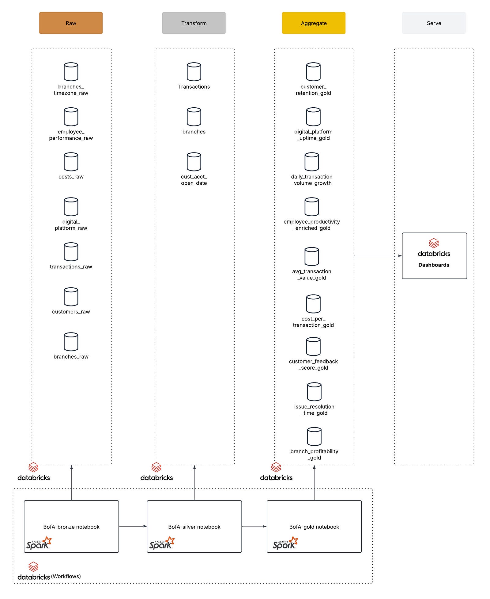
Depicted in diagram 1 above, I chose a Medallion architecture design for this assignment. Additionally, each medallion layer has a notebook in Databricks that is run through Databricks Workflows as an orchestration to generate the final data for the dashboard to consume. Let’s break down the components of each layer and their key characteristics:
Data layer

Remember this guy? “Silver and Gold”. He was all about silver and gold, however the Bronze layer is one of the most important parts of this design.
Bronze (raw) layer: the foundational stage where raw data is ingested into your data lake
Raw Ingestion: data from various source systems (e.g., databases, logs, CSV files) is ingested without significant transformations. This layer captures the data in its original, unmodified form, preserving its granularity and detail.
Single Source of Truth: the Bronze layer serves as a historical record of all data events. It’s crucial for auditability and for reprocessing data if downstream transformations need to be adjusted.
Okay, now lets get to the layers that I think Yukon Cornelius would love.
Silver (transform) layer: transform and enrich your raw (Bronze) data to make it more useful for downstream analytics
Data Enrichment: join related data sets from different sources. For example, you might enrich raw branch data with time zone information or merge customer data with their first transaction dates
Data Cleaning and Standardization: remove duplicates, handle missing values, and correct any errors
Gold (aggregate) layer: contains the final transformations (aggregations, calculations, and enrichments) that are ready to be consumed by dashboards or reporting tool
Business Readiness: the data in the Gold layer is curated and enriched so that it directly answers business questions.
Optimized for Reporting: designed to be fast and efficient for query performance since it’s the final output that many dashboards and reports will query.
Notebooks
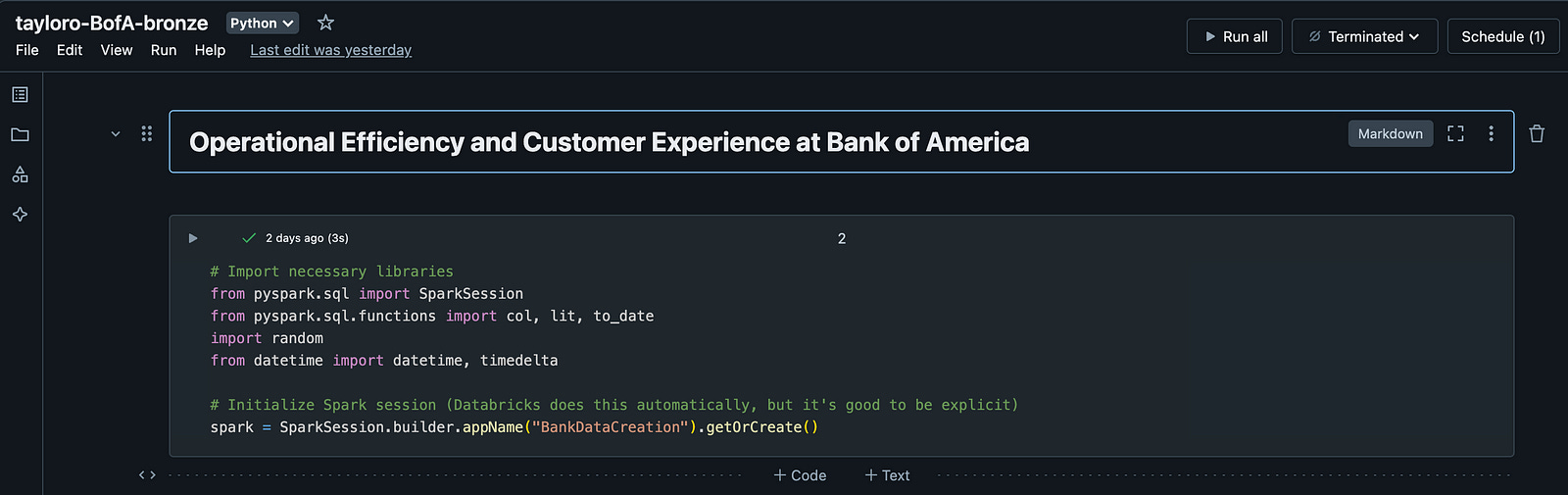
Each layer contains its own notebook in Databricks that is executing logic using Apache Spark. You can conceptualize how each layer is managed by the bronze workbook example image above. This notebook is all about data creation for this exercise, however typically the data already resides in Databricks as the output of some upstream ETL process or you could even make callouts in this workbook to perform some data extracts from source systems directly.
For this exercise, the bronze workbook will generate the necessary data into our tables, simulating an extraction process that has already taken place so that we can further transform and aggregate in the downstream layers.
Silver and Gold also have their own respective notebooks that perform transformative and aggregate queries.
Databricks Workflows
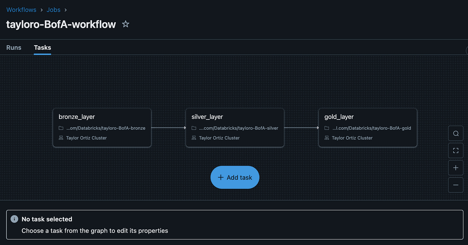
Databricks Workflows is a managed orchestration service, fully integrated with the Databricks Data Intelligence Platform. Workflows lets you easily define, manage and monitor multitask workflows for ETL, analytics and machine learning pipelines. With a wide range of supported task types, deep observability capabilities and high reliability, your data teams are empowered to better automate and orchestrate any pipeline and become more productive.
In this use case, we have three tasks: bronze_layer, silver_layer and gold_layer. With this orchestration, the bronze_layer task executes data creation, the silver_layer task depends on the success of the bronze_layer and appropriately transforms in the data we need to set up for the gold_layer task, which depends on the success of the silver layer and aggregates the data appropriately into tables that are business ready to visualize our KPIs.
So where does the data come from?
Normally, our raw layer would consist of source extracts from various data sources that contain the data that will serve our KPIs in the end. Since this is an example assignment, the first step is to create a notebook in Databricks that facilitates the creation of the following tables and their respective data (you can see the actual table names in the architecture diagram above):
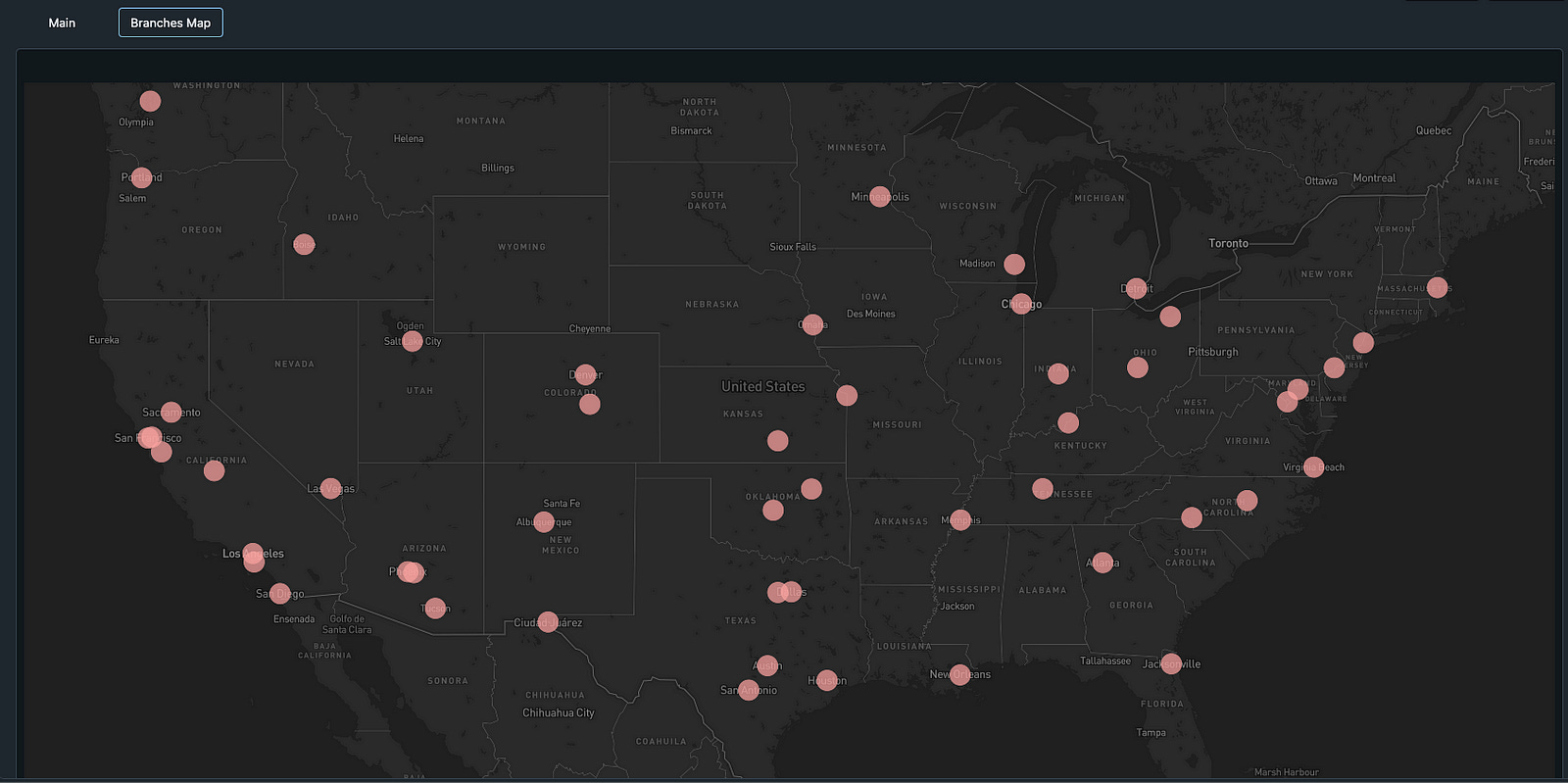
Branches: represents physical branches of the bank
Customers: represents customers who interact with the bank
Transactions: captures financial transactions performed by customers
Digital Platforms: represents online and mobile banking systems
Employee Performance: tracks performance metrics for branch employees
Costs: tracks operational costs for branches and digital platforms
Branches Timezones: the timezone for each branch region
What does manual data creation look like?
Here is an example of what the data creation looks like for customer data executed in the bronze layer. Here, we are creating 10,000 sample customers across a variety of ages, account types and account balances. I am using a very similar tactic for all of the tables that you see above.
from pyspark.sql import SparkSession
import random

spark = SparkSession.builder.appName("BankDataCreation").getOrCreate()

# Generate sample customer data for 10,000 customers
customers_data = []
for cid in range(1, 10001):  # cid goes from 1 to 10,0001
    # Explicitly set the customer_id using the loop variable
    customer_id = cid
    name = f"Customer{cid}"  # e.g., "Customer1", "Customer2", etc.
    age = random.randint(18, 80)
    account_type = random.choice(["Savings", "Checking", "Business"])
    account_balance = round(random.uniform(1000, 100000), 2)

    # Append a tuple where the first element is the customer_id
    customers_data.append((customer_id, name, age, account_type, account_balance))

# Define the column names corresponding to the tuple structure
columns = ["customer_id", "name", "age", "account_type", "account_balance"]

# Create the DataFrame using the generated data and the specified column order
customers_df = spark.createDataFrame(customers_data, columns)

# STEP 1: Create an empty table if it doesn't exist with the defined schema
spark.sql("""
    CREATE TABLE IF NOT EXISTS tayloro_bofa_customers_raw (
        customer_id INT,
        name STRING,
        age INT,
        account_type STRING,
        account_balance DOUBLE
    )
    USING DELTA
""")

# STEP 2: Overwrite the data in the table with our DataFrame
customers_df.write.format("delta") \
    .mode("overwrite") \
    .option("overwriteSchema", "true") \
    .saveAsTable("tayloro_bofa_customers_raw")

print("Table created (if needed) and data loaded into tayloro_bofa_customers_raw.")
Considerations for manual data creation
The most important consideration I ran into while generating data is how to make sure that it looks realistic. For instance, lets consider the example above where we are generating account balance data for each of our 10,000 customers. When generating transactional data for these customers that include withdrawals, transfers and deposits, its important to ensure that we take the account balance in account (ha) and create realistic data that does not send some customers into a super negative amount or reflect poorly when we eventually calculate total profitability for each branch.
I really enjoyed solving for this example because of how much it made you think about the data you were creating and how it needed to naturally fit within the bronze layer tables.
Let’s Transform
Now that we have our initial data created for our bronze layer, its time to move and focus on specific transforms we will need to build to enable the eventual golden layer. Here are three scenarios that are considered for the silver layer in this assignment:
bofa_branches: in this transformation, we are performing a left join with bofa_branches_raw and bofa_branch_timezones_raw on the region attribute so that we can map time zones to each branch
bofa_cust_acct_open_date: in this transformation, we are performing a left join on customer_id with the bofa_customers_raw and bofa_transactions_raw tables to determine their earliest transaction date. This will go on to support the customer retention KPI finding
bofa_transactions: when creating this data, I originally had it exist as a timestamp so that I could showcase a format transformation in the silver layer and convert the timestamp to a date to support the Transaction Volume Growth KPI.
Let’s Aggregate
Now that we have our silver layer incorporating the right transformational changes to our data, its time for us to generate our gold layer tables that will support and be featured in our dashboard. The following tables were created:
bofa_customer_retention_gold: this script calculates the customer retention rate from account open dates
bofa_daily_transaction_volume_growth_gold: this script aggregates transactions by day, calculates day-over-day transaction volume growth using a window function
bofa_avg_transaction_value_gold: this script calculates the average transaction value by dividing the total transaction amount by the transaction count
bofa_digital_platform_uptime_gold: this script simulates digital platform uptime by assuming a 30-day period equals 43200 total minutes, generating a random uptime between 90% and 100% of that time, and calculating the uptime percentage
bofa_employee_productivity_enriched_gold: This script groups raw employee performance data by branch, calculates employee productivity by dividing total tasks by employee count, and enriches the result with branch names
bofa_cost_per_transaction_gold: This script aggregates total costs and transaction counts and calculates cost per transaction by dividing total cost by transaction count
bofa_customer_feedback_score_gold: This script aggregates customer feedback scores from the employee performance table and calculates the average feedback score while handling edge cases
bofa_issue_resolution_time_gold: This script simulates average issue resolution times for digital platforms based on reported issues, aggregates the total resolution time and issues across platforms, and calculates the overall average resolution time
bofa_branch_profitability_gold: This script aggregates revenue and costs by branch, calculates branch profitability by subtracting total costs from total revenue, and enriches the results with branch names
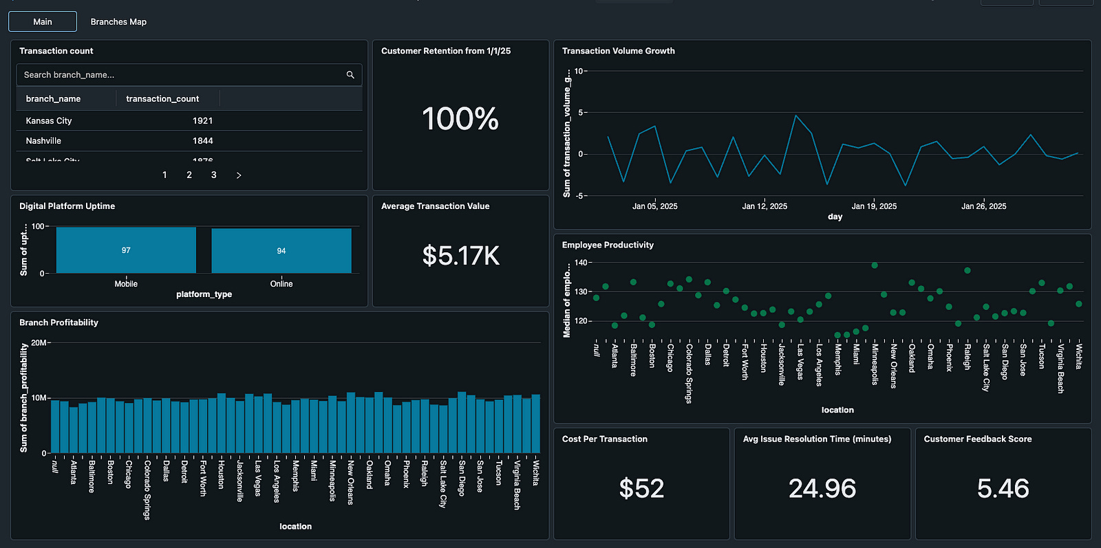
Putting it all together
With these gold level tables created, it was time to run the orchestration so that the data could be created, transformed where appropriate, and aggregated together to support visualizations inside of Databricks. What you see below is the final result.
In conclusion, this project demonstrates the power of the medallion architecture and Databricks’ notebook and orchestration capabilities to transform raw operational data into actionable insights. By systematically ingesting data in the Bronze layer, refining and enriching it in the Silver layer, and finally aggregating key KPIs in the Gold layer, we’ve built an end-to-end pipeline that not only optimizes operational efficiency and cost management for Bank of America but also empowers data-driven decision-making. The orchestration with Databricks Workflows ensures that each transformation stage is executed reliably, resulting in a robust platform that can scale with the evolving needs of the bank. This comprehensive solution highlights the real-world impact of modern data engineering techniques in the financial industry and marks a significant milestone in my data engineering journey.